SocialPilot works fine until your operation grows past one approver. The moment you add a second client, a brand-compliance check, or a legal reviewer, the cracks show up: single-tier approvals, no post-specific commenting, a 2018-era UI, and a pricing model that...
Redesign For multi-location brands
all your locations, one content flow
For multi-brand companies
content collaboration at scale
For agencies
impress your clients and take on more
“The team loved it from the start. Planable helps us overview the entire marketing efforts.“
How do you make your business noticeable without having to repeatedly tell consumers your name and tagline? By optimizing your brand identity, that’s how! A strong brand identity helps your customers recognize you immediately, with even the barest of information. In this piece, we will explain how you can choose fonts and colors for your brand guide that will make your brand memorable.
Your brand identity design not only sets you apart from other brands, but it portrays what your brand is about and what product and service you are providing.
When designing a brand guide identity, your aim is to achieve brand loyalty from your customers. Creating a strong brand identity, and managing your brand well over time, will lead to a positive brand image.
What is a brand image?
Your brand image is what is perceived by consumers. If they have a good impression of your brand, it will lead to better sales as well as brand loyalty.
Consistency is key to adopting a strong brand guide identity. According to recent branding statistics, consumers need to interact with your brand 5-7 times before they remember your brand.
You need to incorporate your branding in every visual medium — from flyers and brochures, print and digital ads, email templates, to social media videos. And there are tools for everything — you can even make a flyer and personalize it without having a professional designer behind it.
Creating a strong brand identity is not an easy task. In the below branding guide, we will break down what you need to do to make your brand stand out.
Brand guide – personality
Before you begin working on your identity, you first need to define your brand style and personality. Understanding the personality behind your business will inform the kind of logo you will create, your choice of fonts and typography in logo design and brand’s color theme.
If you’re wondering how to define your brand personality, ask yourself how you want customers to perceive you. Are you playful, creative, sleek, or formal?
Are you a combination of two of those traits? Analyze your business and ask members of your target audience for their thoughts, as well.
With those answers in place, you should pick up to four personality traits that you feel are the closest match to your brand, and that is how you can describe your brand personality.
Once you have defined your brand personality, you can begin the process of building a brand. If you have a graphic designer, you can enlist their help in making a logo, or else you can use a logo maker to create your logo design.
Making a logo will require you to choose brand fonts and brand colors that best reflect your personality according to your brand guide. Using a font generator to get inspiration as a starting point will help you develop your logo in a more streamlined way.
Brand guide – fonts
The right font can convey so much about your brand and it’s essential to include it in your brand guide. Fonts give underlying meaning and purpose to your message.
But, choosing a font that speaks to your brand is a tough ask—there are thousands of fonts available.
However, unless you have the graphic design skills to create a font from scratch, you will want to sift through the available options and pick the ones best for you. Opting for a graphic design subscription service can streamline the font selection process, ensuring your brand message is effectively communicated.
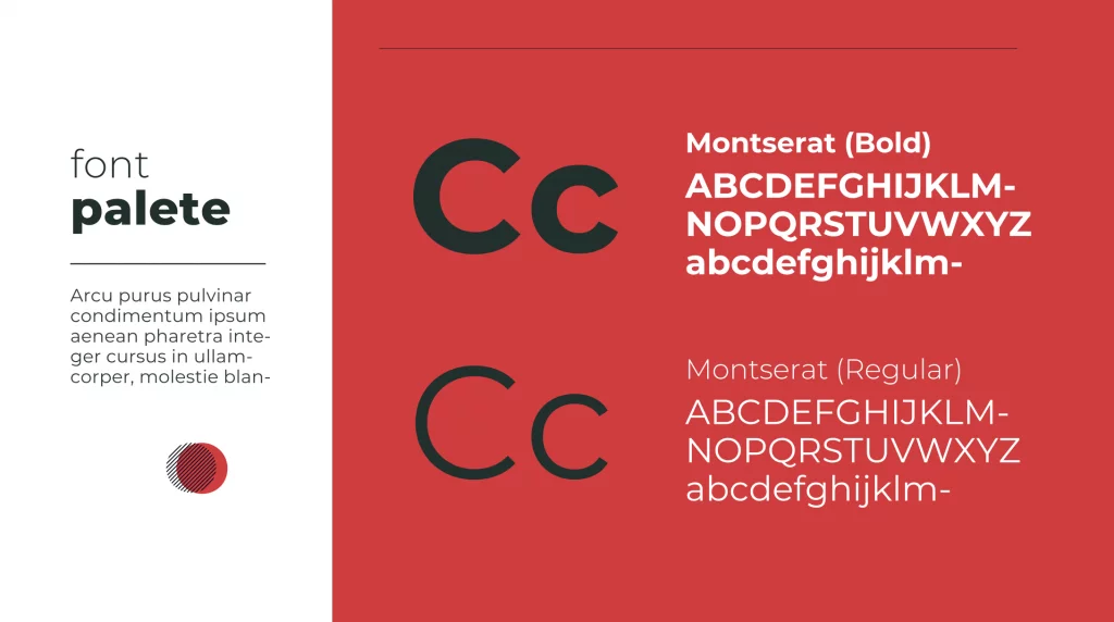
When it comes to choosing brand fonts, it is best to limit yourself to three—one for your heading, one for sub-headings, and one for your body copy.
More than three fonts will make your brand appear haphazard and will be difficult to incorporate in your content marketing. You can read more about content marketing here.
Less than two fonts will make it hard to distinguish your headings from your body copy, thus losing the impact that a headline is meant to have.
With so many fonts to choose from, how do you decide which one suits your business best? We look at the different font categories and how they convey brand identity which will be essential to all your marketing campaigns.
Font categories
There are six basic font categories that we will be examining:
Decorative
Handwritten
Script
Sans Serif
Serif
Slab Serif
Impress your clients with this social media presentation template
1. Decorative fonts
This font category includes highly stylized fonts that are creative and unique. These fonts are usually created by companies and are copyrighted for their own use.
Disney, Lego, and Toys R’ Us are some of the brands that have decorative fonts.
Here are four decorative fonts you can incorporate into your brand guide:
Berliner
Fredoka One
Lobster Two
Rosella
If you want to showcase your brand’s originality and fun personality, the decorative font is the right choice for you.
2. Handwritten
For a more whimsical and informal approach, you can use a handwritten font. Though not actually handwritten, these fonts mimic the handwritten style.
Not many popular brands use this style, but that could make your brand look more distinctive if you use it.
Here are four handwritten fonts you can incorporate into your brand:
Caveat
Goudy Text
Lombardic
Permanent Marker
Handwritten fonts give your brand the appearance of being approachable and playful. If that is the personality you want to convey, you should opt for a handwritten font.
3. Script
While handwritten fonts showcase your brand’s whimsy, its close cousin, the script font, will highlight your elegance. Script fonts capture the best of the cursive handwritten style and look distinctive and beautiful.
Brands that use the script font include Johnson and Johnson, Coca-Cola, Cadillac, and Instagram.
Here are four script fonts you can incorporate into your brand:
Allura
Belinda
Pacifico
Thirsty Script
Though they may seem somewhat old-fashioned now, script fonts are excellent for showcasing your brand’s creativity and elegance. And considering that even Instagram adopted the style, script fonts may not be as old-fashioned as many think.
4. Sans Serif
For a modern and sleek look, you could use a sans serif font. Created far later than the traditional serif fonts (which we will discuss in a moment), sans serif fonts, embody simplicity and minimalism. The letters in sans serif fonts are distinctive and well-spaced out, making them easy to read.
Brands that have used sans serif fonts include Google, Facebook, and Calvin Klein.
Here are four sans serif fonts you can incorporate into your brand:
Helvetica
Open Sans
Optima
Roboto
For a clean, modern look, you can’t go wrong with a sans serif font.
5. Serif
Created in the 15th century, the serif font is the oldest of all the categories and tends to be very traditional in its appearance.
A number of established brands like Time Magazine, Tiffany & Co, and Abercrombie & Fitch use serif fonts in their logos. Serif fonts are also often used in menu writing by fine-dining restaurants because they evoke class and refinement.
Here are four serif fonts you can incorporate into your brand guide:
Baskerville
Century
Garamond
Times New Roman
If your company has a traditional appeal, a serif font will effectively convey that personality. Now, you can also consider combining serif and sans serif fonts if you’re looking for a versatile typographic palette that balances tradition with modernity. Utilizing both styles strategically can create visual interest and hierarchy within brand communication.
6. Slab Serif
Slab serif fonts are a version of the traditional serif font but tend to be bolder and quite quirky. They were designed to stamp their individuality on the world—that they were a departure from traditional values.
Brands that use this font include Honda, Sony, and Volvo.
Here are four slab serif fonts you can incorporate into your brand:
Arvo
Courier New
Didot
Museo
For companies that want to make a bold statement and exude confidence, a slab serif font will do the job.
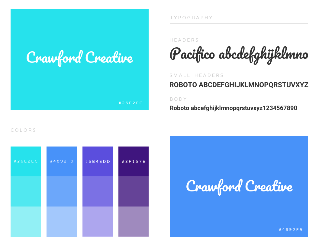
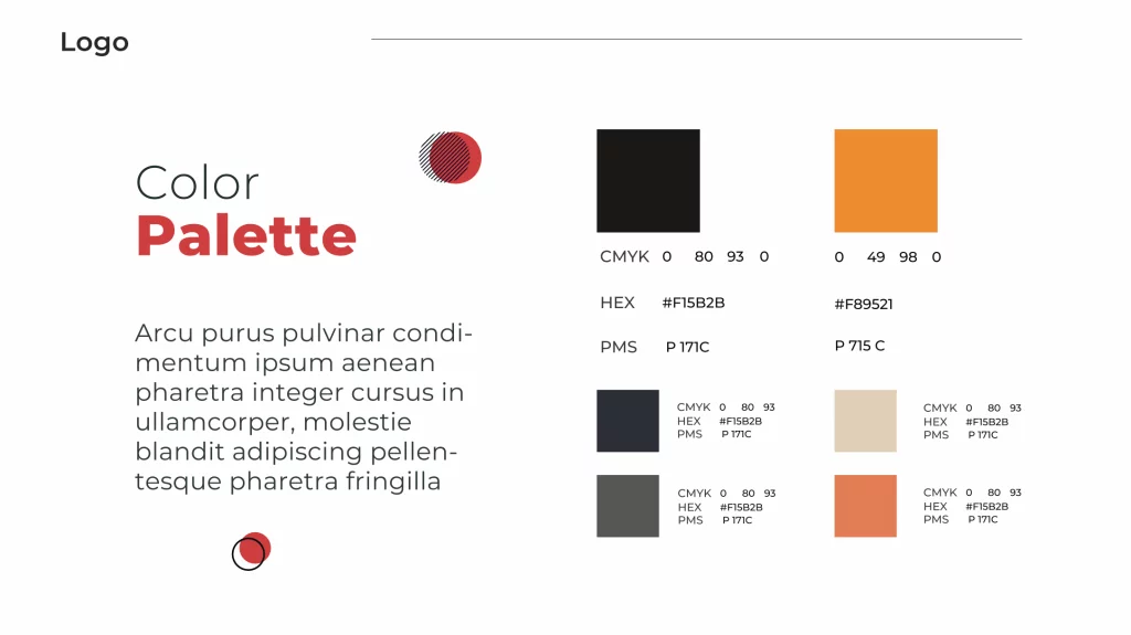
Brand guide – colors
While brand fonts convey plenty of meaning in your messaging, brand colors have the power to portray emotions. Choosing the right color palette will not only make your brand stand out but will also invoke strong responses in your audience.
The color spectrum is incredibly wide and you may feel that limiting yourself to a small set is detrimental to sharing your messaging.
However, it is far more valuable to choose a set number of colors and shades that identify your brand to audiences, than dabble in too many colors that may cause people to confuse you with other brands.
A little note: you’ll most likely use this color scheme to create a website or blog for your brand. Deciding on color can be challenging but with this brand guide, you will get a complete understanding of what various colors can convey. Though it’s crucial choosing a suitable brand color for your website, make sure to select a unique name for your business and buy domain name from an affordable provider before starting to build a site.
What do different colors mean in a brand guide?
Colors do not exist in a vacuum—people tend to associate feelings with different colors. Depending on the feeling you want your customers to feel, you can choose your core brand color.
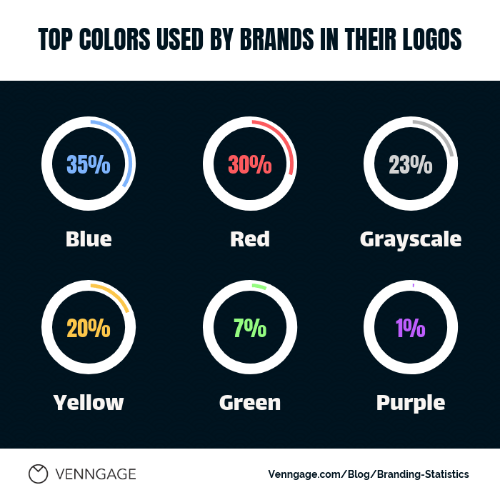
The core color of your brand will be the most prominent—it will feature strongly in your logo and the visuals you create. Let us look at the most common colors used in brands.
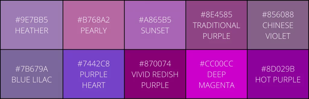
Purple is an authoritative color that also conveys sophistication and power. Purple used to be associated with royalty as only monarchs were able to afford the expensive color.
Even though many rich nobles were eventually able to purchase purple fabric, Britain’s Queen Elizabeth I was rumored to have barred anyone but the closest royal family members from wearing the color. Hence its association with royalty.
A few popular brands who use purple in their logos are:
Cadbury
Taco Bell
Yahoo!
For companies who want to exude an air of mystery and creativity, purple is a great choice.
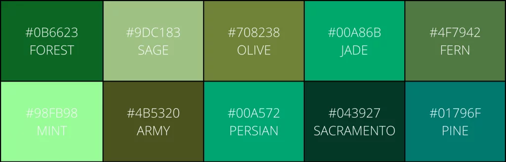
2. Green
Unsurprisingly, green is generally associated with nature, rejuvenation, freshness, and health. There are numerous shades of green that can be used as a brand color.
Lighter shades represent energy and liveliness, whereas darker shades can be used to convey wealth.
A few brands that use the color green include:
Animal Planet
Starbucks
Heineken
Green is a good choice for eco-friendly brands or startups, as well as brands that are oriented towards younger audiences.
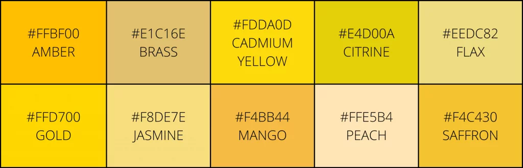
3. Yellow
Yellow is all about portraying a fun, friendly vibe, but is also related to joy and optimism. Most brands tend to use brighter shades of yellow in their logos—barely any have dark yellow, most likely because it comes across as unattractive and tends to look a bit morbid.
Brands that use yellow as their brand color include:
Subway
Nikon
IKEA
For brands that want to capture the happiness of sunshine in their logo, yellow is an ideal option.
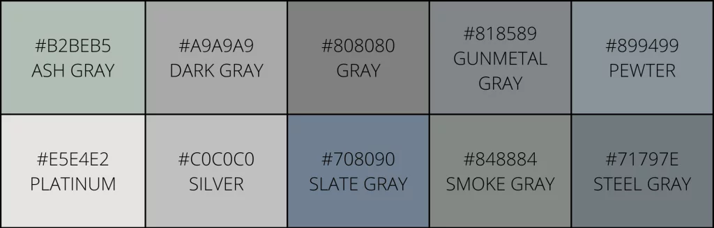
4. Grayscale
The grayscale, black, or monochrome approach embodies minimalism and elegance. It also stands for power and authority, which is probably why grayscale ranked third on the list of most popular brand colors.
A number of brands also create grayscale versions of their existing logos, which could have contributed to the color’s popularity.
Some brands that use grayscale or monochrome logos are:
Honda
Apple
Squarespace
For the minimalist, elegant look, grayscale is a great choice for your brand.
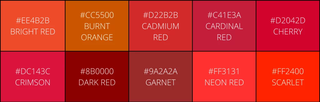
5. Red
Red is the color of excitement, passion, energy, and danger. For all those reasons, red is the second-most popular brand color. It is immediately noticeable from a distance and memorable.
There are numerous brands that use various shades of red in their logos. Some of the most famous are:
Red Bull
KFC
Ferrari
Virgin
To really make your brand pop, red is the color you should choose.
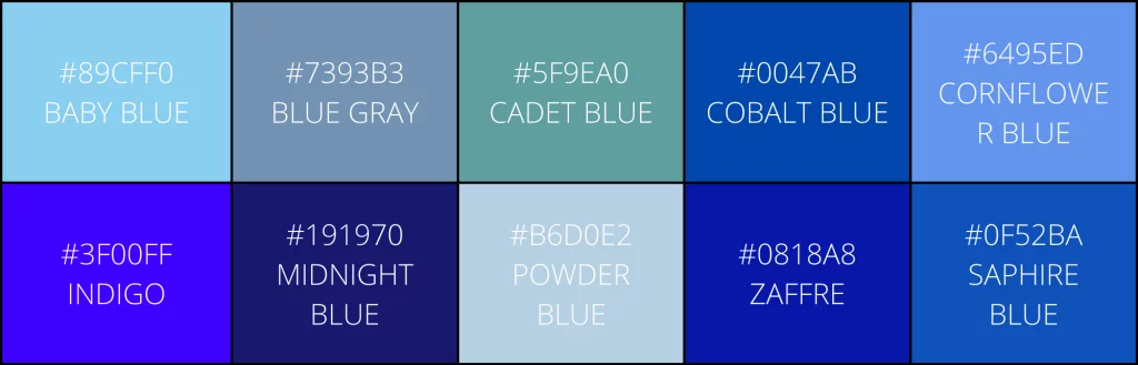
6. Blue
Blue is the color of the sea and the sky. It is striking and gives viewers a sense of peace and tranquility. Blue exudes a sense of trustworthiness, stability, and competence. No wonder it is the most popular choice as a brand color.
There are multiple popular companies that use blue in their logos. Some of the most memorable are:
Facebook
Paypal
Volkswagen
GE
For a company that wants to radiate steadiness and promise, blue is perfect.
Brand guide – color combinations
Once you have your core brand color, you can work on creating a brand color palette. Though you can use one single dominant color, with grayscale variations, you can also choose to adopt two or three colors, if that better conveys your brand personality.
Brands like Nike, which has an all-black or all-white logo, or T-Mobile, which has a pink logo, have made their single-color logo work for years. Netflix and Spotify also only have a single color and immediately distinguishable.
On the other hand, Dunkin’ Donuts has two strong colors, and Subway has three. These are both memorable logos, as well.
If you are planning to add more than one color, you have the option to choose similar colors to the core color, or shades of the core color, like Mastercard and Paypal, have.
Alternatively, for the more adventurous businesses, adopting contrasting colors can be a great option that makes your logo pop, such as Pepsi or Visa.
There aren’t many companies that can pull off more than three colors, but even when they do, they use their multiple colors judiciously. If you look at Google or Slack, their logos incorporate a number of colors but they are subtly combined so they don’t look jarring.
Remember, the most important aspect of choosing brand colors is that they should speak to your personality and be easily identifiable as you. Armed with that knowledge, you will be able to make a wise decision and begin creating your branded content.
Ensuring brand consistency
You now have a good idea of what you need to know and analyze to choose the right fonts and colors for your brand. These design elements, alongside your logo and tone of voice, will make your brand recognizable to audiences.
But once you have these elements together, you need to ensure that they are consistently and correctly used across all printed and digital materials.
Here are a few ways to ensure brand consistency.
1. Create your own brand guide
With the font, colors, and logo in place, you now need to create your own brand guide.
A brand guide is an excellent resource for your employees and any third parties you are collaborating with so that they can consistently showcase your brand across multiple visuals.
Before you create your guide, take a look at these brand guide examples from Skype, Spotify, and Netflix for inspiration. You can also study this brand guide book to understand what you need to include or exclude.
2. Implement branding internally
While branding is key to gaining customers and spreading awareness, it should also be used within internal communications. Your employees are, after all, your first customers.
Add your logo and use your brand colors and fonts on internal documents such as memos and presentations. Create presentation templates that the company’s employees can access on your server or shared drive.
Another way to incorporate your brand into internal communications is by turning your company logo into a QR code that links to your company website or internal resources. This not only adds a modern touch to your branding efforts but also allows for easy access to important information for your employees.
This will ensure that all communications—internal and external—are consistent with your brand.
3. Get your employees involved
But more than the brand design, work on incorporating your brand’s ethos into your internal communications.
Your employees are your first stakeholders and your primary audience. Give them a breakdown of your company’s values, and highlight internal company culture on social media.
Not only will this merchandise foster a feeling of belonging in your employees, but it will also act as a brand awareness opportunity whenever they share photos of themselves at work.
Brand promotion
Having chosen the best fonts and colors that speak to your brand, and created a brand guide that effectively conveys how and when to use your logo, you are in an excellent position to promote your brand. As everything happens on social media nowadays, I imagine your brand is there, too.
More than 7,000 teams all over the world use Planable. We’re a social media collaboration tool designed for teams and obsessed with design. This is why we’re vouching for pixel-perfect posts you can preview as live. Honor your brand with the tools it deserves. And if you want to give Planable a spin, you should know it’s free.


 Your company’s brand identity includes visible elements that
 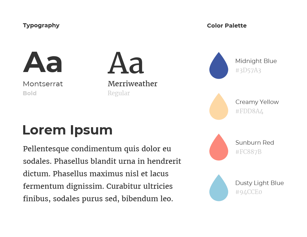 Before you begin working on your identity, you first need to define your brand
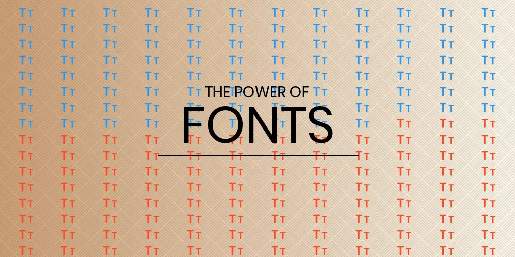

 But once you have these elements together, you need to ensure that they are consistently and correctly used across all printed and digital materials.